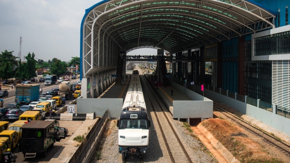

The transit map is the gateway to any given public transport service, but its ubiquity makes it easy to take for granted. Perhaps this is because most transport authorities believe the art of the transit map was mastered decades ago, but regular design and accessibility issues for services around the world provide a stark warning against complacency in this area. As recently as April 2014, transport authorities in Sydney came under fire after a redesigned rail map was branded confusing and potentially misleading, highlighting the myriad complexities that come along with designing an effective public transport map.
Go deeper with GlobalData

This comes as no surprise to Australia-born, Portland-based Cameron Booth. As a veteran graphic designer with 20 years of experience under his belt, Booth knows a thing or two about communicating with the customer through clean, expressive visuals. He is also a long-standing transit map enthusiast who spends his spare time running one of the internet’s most popular transit map blogs. Chris Lo caught up with Booth to discuss the dos and don’ts of transit map design.
Chris Lo: What prompted your interest in transit maps?
Cameron Booth: As a designer, I’ve always been interested in transit mapping as a specialist subset of design, but my love of it really goes back to a trip to England and Paris way back in 1997, where I first used the London Tube and the Paris Metro, and their respective maps. I bought a book about the Tube Map, ‘Mr. Beck’s Diagram’, from the London Transport Museum, which really puts this celebrated piece of design into a proper historical context; an absolutely fascinating read. That’s where it all started!
CL: In your mind, what are the essential elements of a really effective public transport map?
CB: A strong informational hierarchy is an absolute necessity. By that, I mean that the most important elements of the map should be immediately and intuitively obvious. Transfer/interchange stations need to be clearly shown – working out where to interchange with other services is always one of the biggest challenges faced by transit users.
See Also:
Route termini should be clearly marked, especially if trains or buses refer to those endpoints on their signboards (i.e. Piccadilly Line to Cockfosters). Here, the Paris Metro map does a better job than the London Tube map, for example, as it makes the station name bolder and shows the route numbers that terminate there.
How well do you really know your competitors?
Access the most comprehensive Company Profiles on the market, powered by GlobalData. Save hours of research. Gain competitive edge.

Thank you!
Your download email will arrive shortly
Not ready to buy yet? Download a free sample
We are confident about the unique quality of our Company Profiles. However, we want you to make the most beneficial decision for your business, so we offer a free sample that you can download by submitting the below form
By GlobalDataIf there’s more than one mode of transportation shown, then the pre-eminent one needs to stand out the most to make it easiest to find. A good example of this would be a subway map that also shows connecting commuter rail, bus and ferry connections: the subway needs to be shown as the most important part of the map, and each other service should be indicated in descending order of importance with progressively thinner route lines/smaller labels, and so on.
And these days, frequency of services is increasingly becoming an important thing to show as well. People don’t like to wait for transit, so a promise of fast, frequent service is a big plus.
CL: How can good design make a map intuitive to use, even for newcomers?
CB: Good design makes its intent immediately obvious. Nothing on a transit map should be confusing or ambiguous to the user; the less they have to look to a legend or a call-out box to interpret the map, the better. CHK America, a transit mapping company based out of California, believes that people will only look at a transit map in a real-world environment for eight seconds before giving up, so you’d better make those eight seconds count!
Making a unique-looking transit map is all well and good, but not at the expense of usability. Use established design conventions when they’re appropriate – a white "P" in a blue circle is a universal symbol for parking, so why invent a whole new icon that no one has ever seen before to show parking lots? The information hierarchy I mentioned goes a long way towards creating that intuitive design.

CL: Transport authorities in Sydney were recently criticised for a confusing map redesign – what are the worst design trends commonly seen on public transport maps?
CB: There’s a couple that I think are pretty bad. First, there are purely geographical maps used inappropriately. Some systems just can’t be shown well this way: the central area becomes too crowded with stations, while the outer area takes up way too much room. There are also a growing number of maps that have been exported directly from GIS [geographic information system] software for final use, which leads to some very ugly maps. GIS is a fantastic tool for analysis, but maps generated from it almost always need some further editing before they’re ready to be used as a final, print-ready map.
The other problem is maps that are simplified to a ‘diagrammatic’ form, but without any real understanding of the underlying design principles that make such a diagram truly successful. This is the category that I think the new Sydney map falls into – it appears to be a diagram, but the treatment of the T3 Bankstown Line is anything but, as it weaves around all over the place in an attempt to stay (unnecessarily) faithful to the geographical lay of the land.
With a diagram, it’s not enough to simply draw route lines at 45-degree angles and call it done. There needs to be a rhythm and flow to the route lines, with even and harmonious spacing of the stations along each line. The number of directional changes should be kept to an absolute minimum and a route should always be easily traceable from one end to the other. Too many designers create ‘Tube Map Clones’ simply because they think that’s what a transit map should look like. Sometimes, the 45-degree paradigm simply isn’t appropriate and a designer needs to be aware of when it’s not going to work.
CL: Is there a great variation in transit map styles when comparing different countries or regions?
CB: I wouldn’t say a great variation – the ’45-degree diagram’ is predominant throughout the world – but there are some subtle differences. European transit map design tends to be cleaner and simpler than that out of North America, with more purely diagrammatic maps (barely any reference to real world geography at all). German maps are probably the most homogenous of them all, with a very similar design language used by many of the larger cities like Berlin, Munich and Hamburg. The ever-present green "S-Bahn" symbol is probably a good example of this shared design heritage.
American transit maps are more of a mixed bag: there are no real common design themes between any of the major cities and there’s probably a larger variance in quality overall. There are some really good maps, but also some absolutely terrible ones as well. There does seem to be a larger desire to relate transit routes to the geography of the city in the US, especially in New York, which replaced the famously modernistic – and very European – Massimo Vignelli diagram with a more geographically accurate map.
CL: Is there a place for geographically-accurate maps in certain circumstances?
CB: Geographical transit maps definitely have their place. I tend to think that they work best for bus maps. They’re generally more suited to depicting bus systems simply because they can give the transit user a better spatial awareness of how the bus connects with their neighbourhood.
CL: How do you think digital and mobile tech innovations could benefit (or create problems for) the design of public transport maps?
CB: Digital tech offers some great advantages over the traditional paper map, not least of which is the ability to push real-time information to users, like service alerts or trackwork information. The maps could also modify themselves based on the time of day to show an appropriate map, as night services are often very different to those offered in the day.
However, great thought needs to be taken in designing maps that work well with the devices that they will be used on. There are far too many smart phone transit map apps that are simply direct copies of an existing paper map, which doesn’t create a great viewing experience. The best ones scale the amount of information shown based on the zoom level: a simplified system-wide overview at first, with more and more detail added as you zoom into the map. I’ve done some beta-testing for the new KickMap London, Washington DC and Chicago iPhone apps, and this is something they implement very well.
CL: Do you think a well-designed map that is pleasing to look at and easy to use can actually contribute to the ridership levels of rail networks?
CB: Absolutely! I’m a firm believer that a transit map acts as a large part of the public face of the transit network it portrays. An attractive map that makes travel look simple, fast, modern and easy is always going to have a positive impact on its users. Conversely, a city might have a fantastic transit network, but a poor map that creates a negative perception. A great example of this is the map for the rail transit in Salt Lake City. The system itself is modern and extensive, having expanded rapidly over the last decade. By all accounts, it’s an American transit success story. However, the system map is simply awful: poorly drawn, confusingly labelled and simply ugly. It does not inspire confidence at all.

CL: Do you have a favourite transport map? One that exemplifies all the best design ideals?
CB: One of my all time favourite transit maps is this one that was used in Stuttgart, Germany around 2000. Unusually, it chooses to represent the city’s network on an isometric grid (using 30-degree angles almost exclusively), rather than the more usual orthogonal method, which uses any multiple of 45 degrees. The effect is striking, accentuated by the three-dimensional treatment given to the Hauptbahnhof and its distinctive tower in the middle of the map. For me, this diagram ticks all the boxes:
It’s clear and easy to understand. Routes are easily traceable from one end to the other, interchanges and termini are clearly denoted, icons for points of interest are simple and unmistakeable, and the legend is simple and concise. All of the labels on the diagram are set horizontally, which aids quick reading and comprehension, as well as looking neater than angled labels. The unusual isometric viewpoint helps a lot here, as it allows station names to nest next to the route line nicely, without ever being in danger of clashing with it.
It has a look that is uniquely its own, rather than being yet another Tube Map clone. I absolutely love transit maps that have a sense of place about them, a map that could only ever belong to one city, and this is one of them. To top it all off, it’s also absolutely beautiful to look out. While conveying information is a transit map’s most important function, aesthetics play a huge part as well. As I said above, I strongly believe that transit maps play a hugely important part in the public’s initial perception of a transit system: if the map is easy to use and beautiful to look at, then it will encourage people to use the system.
CL: What features would you like to see more transit maps make use of in the future?
CB: Frequency maps are definitely something I’d like to see more of. Digital mapping really is the next big thing, whether it’s the new interactive kiosks in New York or iPhone apps, and I look forward to seeing innovative new uses of this amazing technology that really helps people make decisions about using transit.